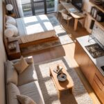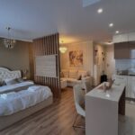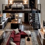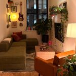
Which of these ideas fits depends on one fact: whether the bed can sit in its own zone, away from where you cook and eat.
The list runs from a free rearrangement like angling the furniture so the sofa faces away from the bed, to a fluted glass partition wall or a lofted bedroom layout.
In a 350-square-foot studio, a renter who can’t drill leans toward screens, stools and rugs, while an owner with high ceilings can build up.
1. Choose a Round Dining Table
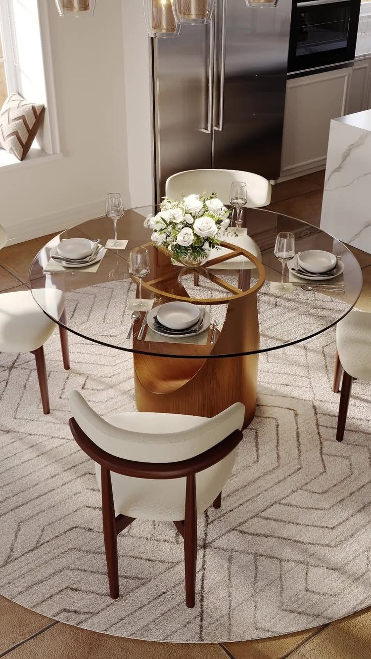
Corners are what you bump into in a studio, and a round table has none. Walking past it at hip height costs you nothing, which matters when the table sits a few steps from the sofa and the stove.
Four chairs fit around a round top more comfortably than around a square one, since people can angle in and out without a leg or edge in the way.
A glass top keeps the sight line open too. I’d pair it with a round rug, as here, so the dining spot reads as its own zone.
2. No Room for a Kitchen Table
A 350-square-foot studio asks a hard question: where does dinner happen?
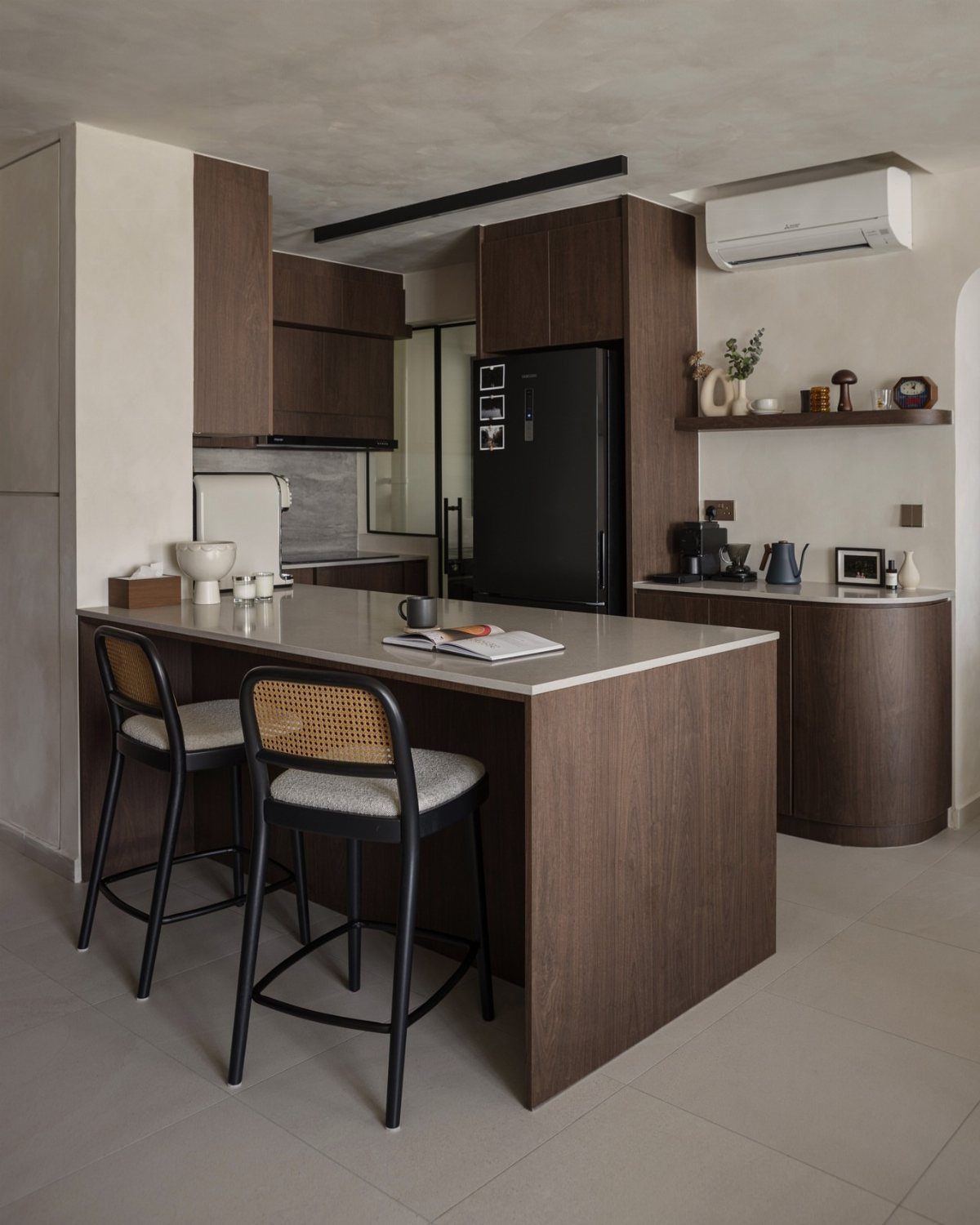
Skipping the table entirely is the cleanest fix in a studio, since the counter takes over as the place where you eat. A kitchen island with 2 stools handles meals, prep and the laptop session in between.
I like this move for one person or a couple.
Stools slide under the counter and leave the open floor free, which a table with chairs never manages. Pick backless or slim-backed stools, like the black and cane pair here, so they read as lighter than they are.
3. Neutral Color Palettes
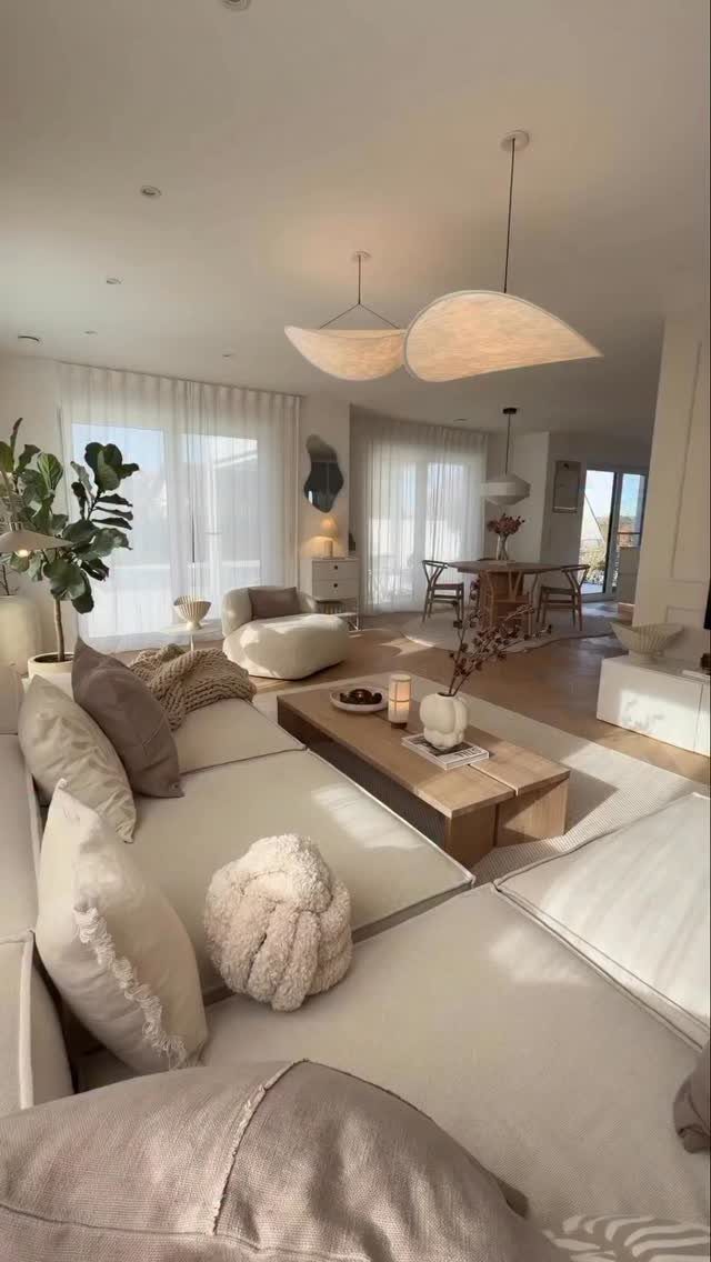
Beige, cream and warm wood do the heavy lifting in an open studio, because nothing in the room fights for attention.
When the sofa, walls and rugs sit in one family of tones, the eye reads one big space instead of three small zones.
Keep the large pieces, like a sectional, in the main neutral. Let texture and material carry variety: a wooden coffee table against soft upholstery adds depth without adding color.
A statement pendant gives a neutral palette a focal point, and a single oversized shade does more than a cluster of small ones.
4. Smart Storage
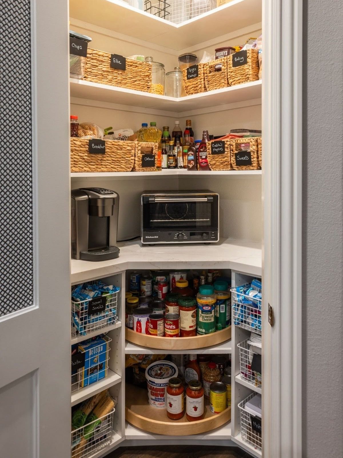
Open shelving with no doors means every jar and appliance is part of the room. I’d treat it as a styling job: matching wicker baskets with labels hide the odds and ends, and the labels keep you from digging.
Save the top shelf for things you grab rarely.
5. Install Floating Shelves
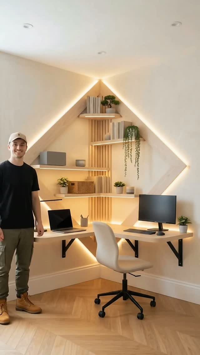
Wall space above a desk is free storage, and light wood floating shelves use it without the bulk of a cabinet.
In a corner, 2 runs of shelves meeting at the angle give you a lot of surface and keep the floor open.
Anchor the brackets into studs for anything heavy, such as books.
6. Use a Fold-Down Desk
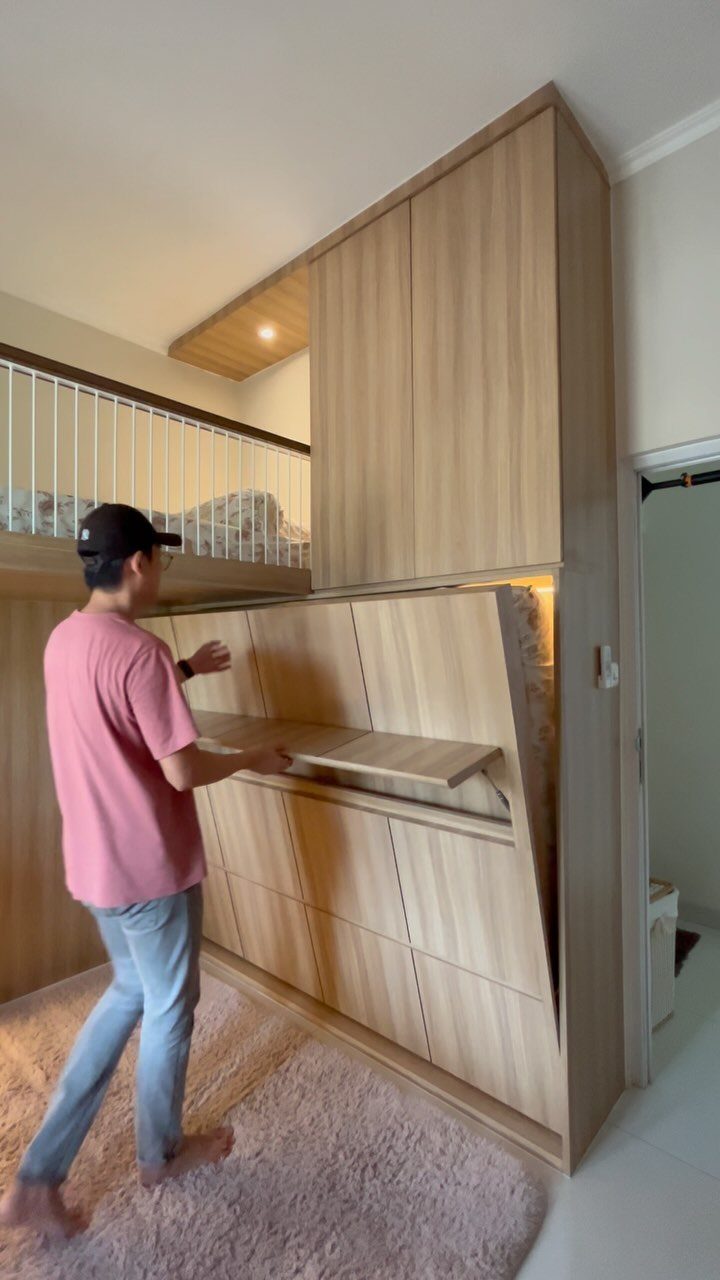
A desk that folds flat against a wall unit disappears when work ends, and in a studio that matters, since the same room is also where you sleep and relax. Closed, it’s just another wooden panel.
Build the desk into a storage unit beside the loft bed, so the desk, shelves and cabinets read as one piece of furniture.
Keep the surface clear of clutter you can’t sweep off in a minute, or you’ll skip the fold-up step.
7. Lofted Bedroom Layout
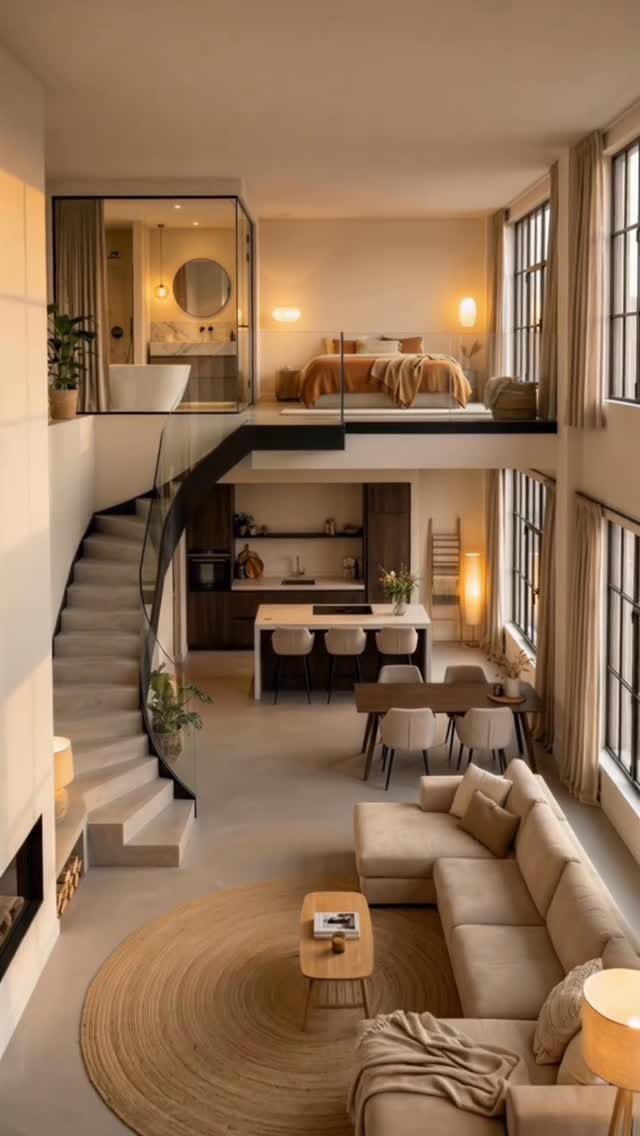
Stairs steal floor in a studio, so a curved one is the detail I’d study first: it sweeps around instead of cutting a straight run through the living area.
Putting the bed up in the loft hands the ground floor entirely to the sofa and kitchen.
High ceilings make this layout work. Neutral furniture below, in whites, grays, or soft wood tones, keeps the loft reading as part of the room instead of a second box stacked on top.
8. Bed and Living Combo Zone
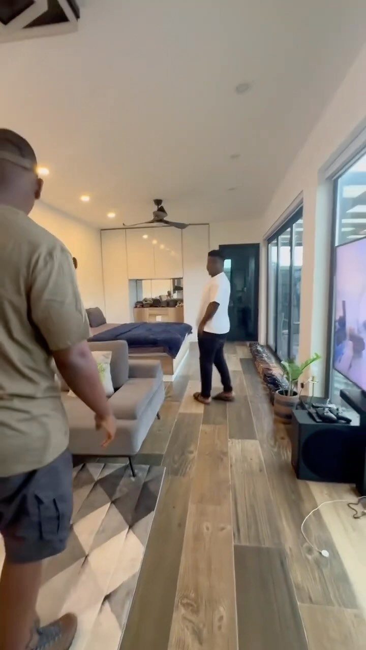
Turn a sofa so its back faces the bed and you have the easiest divider a studio can get, with no building and nothing to drill.
Face the seating toward the TV, and the bed behind it drops out of sight lines while you watch.
I’d anchor the living side with a geometric rug, as here, so the sofa zone has edges the bed zone doesn’t share. Light wood flooring running through both areas keeps the room calm.
Pick a sofa low enough that the bed stays visible as a quiet backdrop, not a wall.
9. Integrated Dining Bench Setup
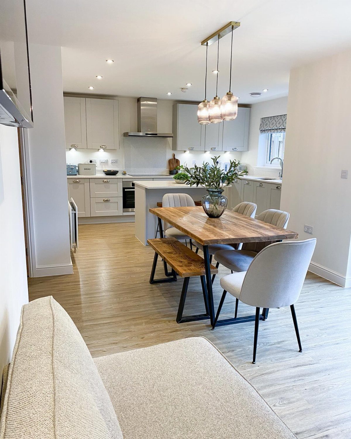
A bench along one side of the table does what chairs cannot: it tucks fully under the tabletop and fits more people into the same length.
Pair it with two or three chairs on the other side, and the wooden table feels like a real dining room next to the kitchen island.
I’d match the bench to the table wood so the set reads as one piece. Grey chair seats soften that, and white cabinetry keeps the whole corner bright.
10. Double Desk Workstation Zone
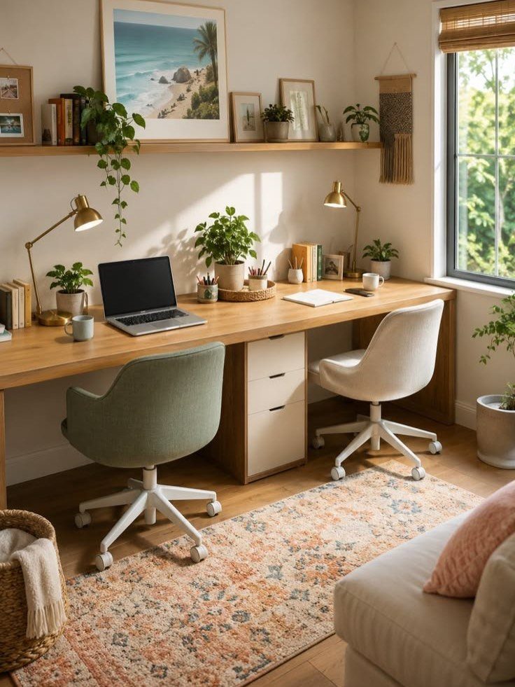
One long desk with two chairs beats two small desks in a studio, because it makes a single clean line instead of two separate pieces. Set it beside the sofa, and the work area stays part of the living room.
I like wood for the desktop, since it looks like furniture and not office gear.
Plants along the surface soften it further. A patterned rug under the chairs marks the zone, and it handles chair scuffs better than bare floor.
11. Pops of Color Accents
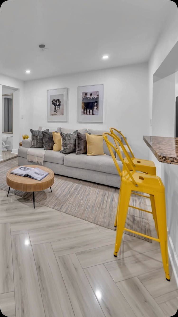
Yellow works because it shows up twice. 2 metal barstools and a few cushions on a grey sofa give the eye a path across the room, where a single yellow object would look like an accident.
Keep everything else quiet: grey sofa, white wall, round wooden coffee table. Pairs of framed prints add interest without extra color.
Cushions are the cheap, swappable part, so buy those first. If you tire of yellow, they change in minutes.
12. Geometric Room Divider Screen
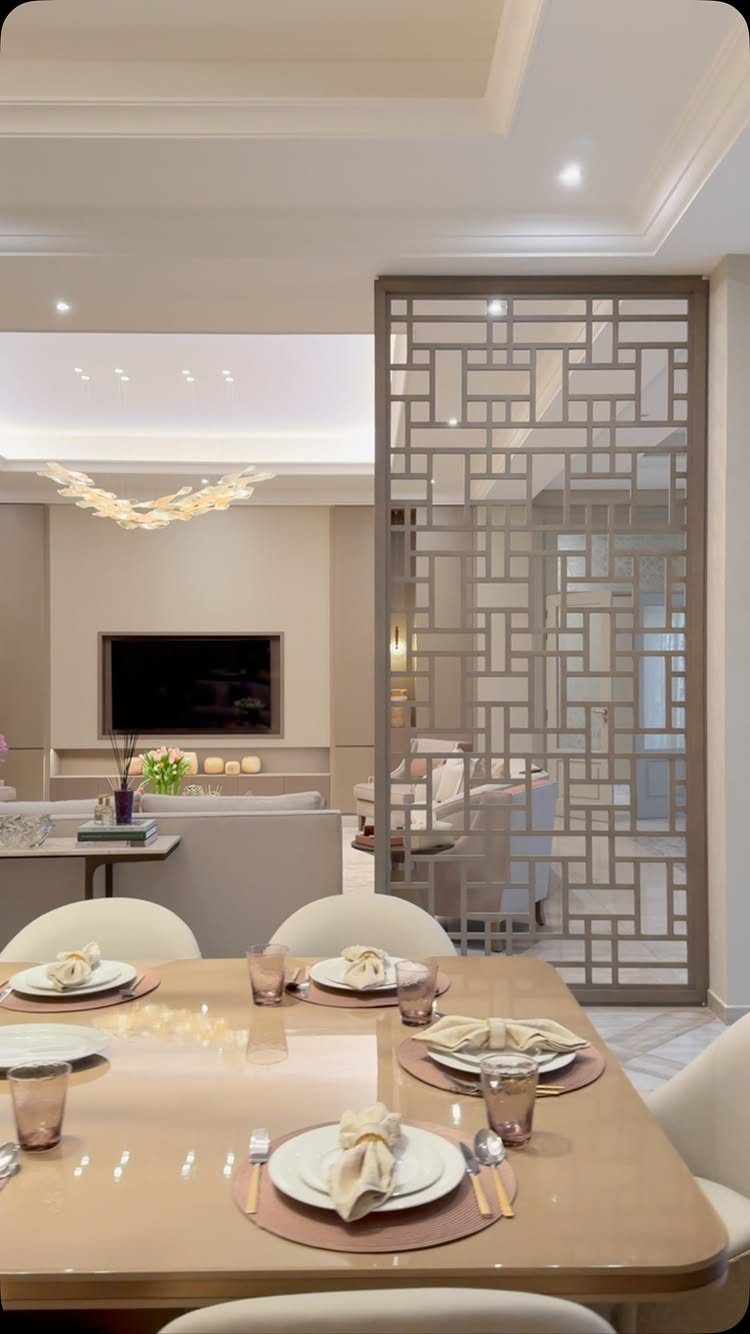
A geometric screen splits dining from living without a wall, and its open pattern lets light and sight lines pass through. A solid divider would make a small studio feel boxed in.
Place it between the dining table and the sofa, so people at the table look at the screen instead of the TV. I’d choose a pattern with fairly large openings, since tight lattice darkens the room.
A screen also stands on its own, so a renter can take it along when leaving.
13. Fluted Glass Partition Wall
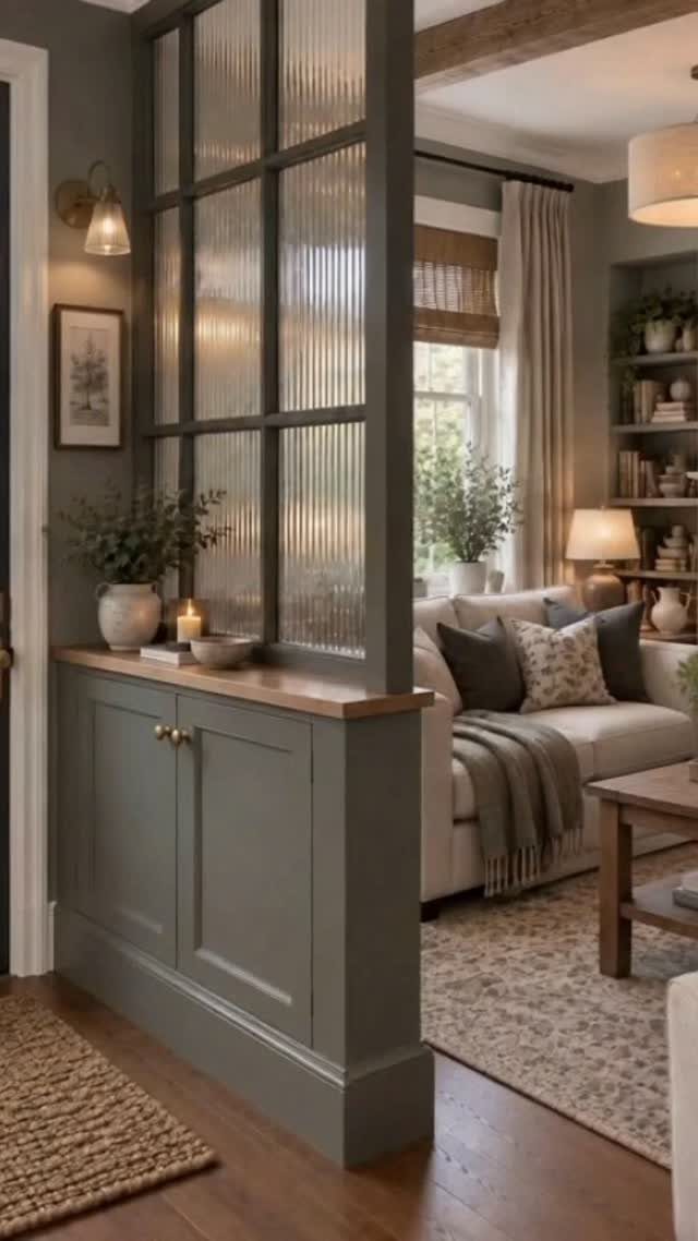
Fluted glass lets light through and blurs everything behind it, so an entry hallway stays bright without looking straight into the sofa.
Setting the glass on top of a built-in cabinet gives the divider a solid base, and the base holds shoes, keys and coats.
Match the cabinet color to the room, grey against grey for example, so the partition reads as part of the wall instead of a separate piece. Fluted glass hides clutter better than clear glass does.
14. Mirrored Sliding Closet Doors
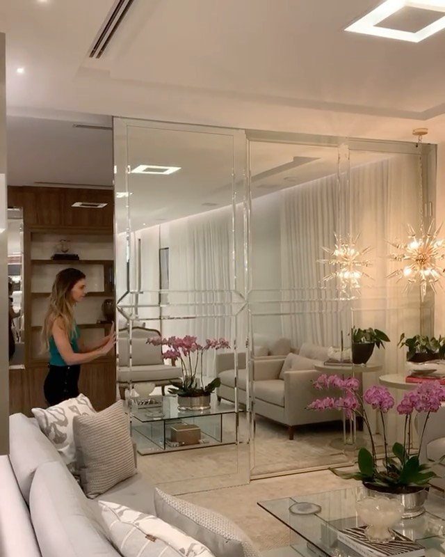
Mirrored sliding doors do 2 jobs in a studio: they hide the closet and they double the view of the room.
Run them floor to ceiling, as here, so the mirror reads as a wall of space and not a piece of furniture.
Sliding doors need no swing clearance, which matters when a sofa sits a few feet away. Face them toward your best light and your nicest furniture, since the mirror repeats whatever stands opposite.
15. Wood Slat Divider Screen
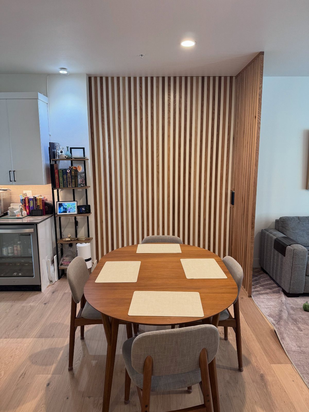
Vertical wood slats mark off the dining corner while the gaps between them keep light moving through the room.
Put the screen behind the table, not beside it, so diners get a backdrop and the sofa side gets a clean edge.
I’d pick a slat tone close to the table wood. The set then looks planned, and the room stays calm.
Wider gaps keep things airy; narrow ones give more privacy.
16. Linear Layout for Narrow Studios
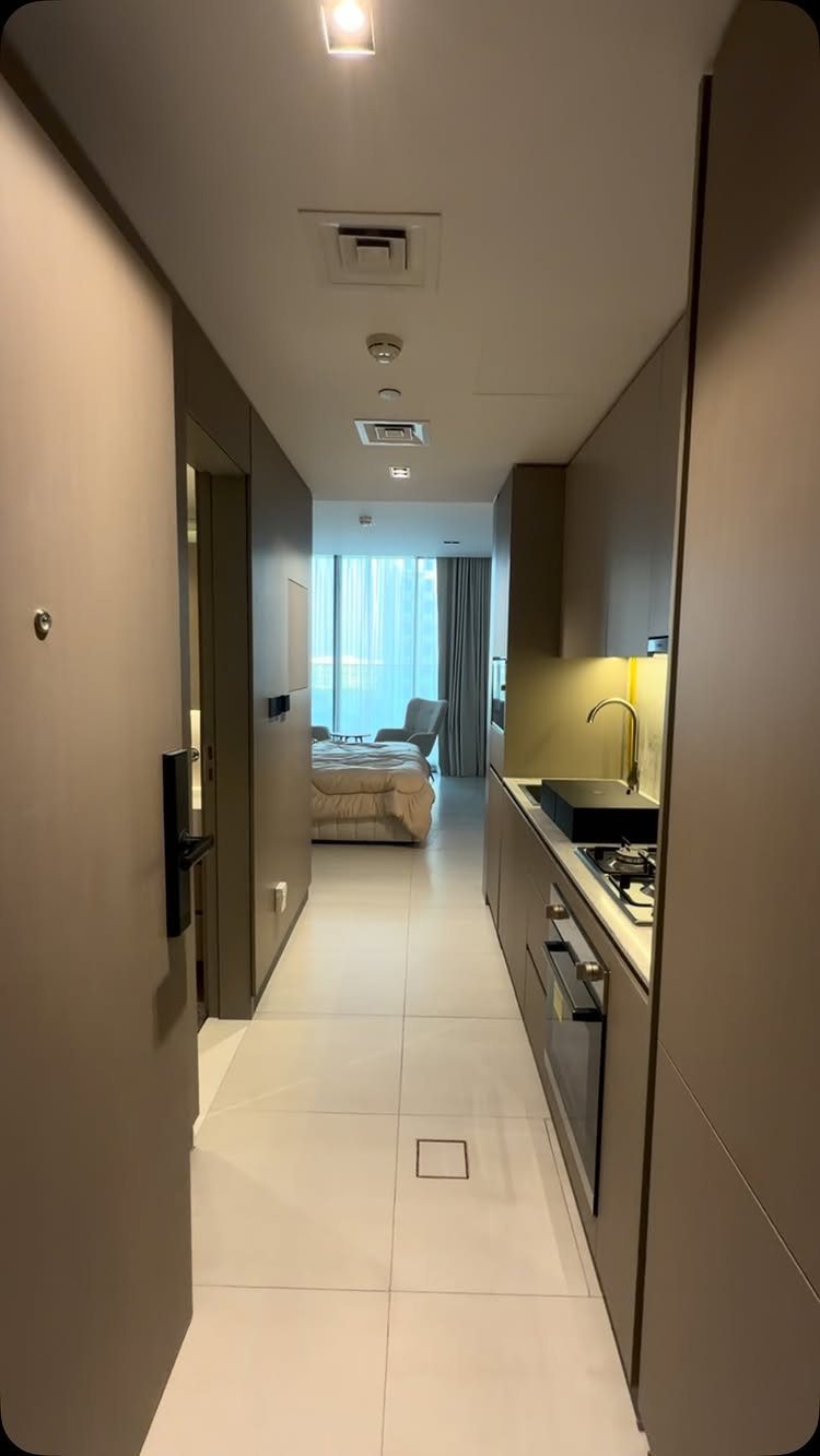
A long, narrow studio works best when you stop fighting the shape.
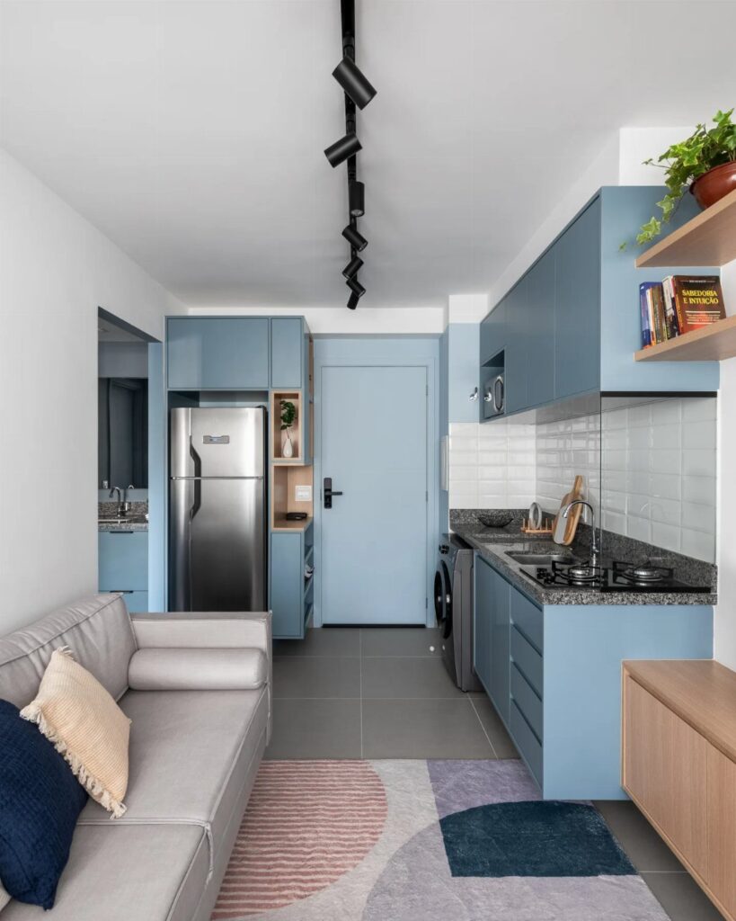
Line the kitchenette up along one wall and let the room run toward the window, with the bed at the far end, so the sleeping area sits as far from the stove as the plan allows.
Keep the opposite wall and the middle of the walkway open, so the layout reads as one clean line.
A straight path from door to window makes a narrow room feel longer instead of tighter, and the window becomes the focal point.
17. Kitchen Island Breakfast Bar
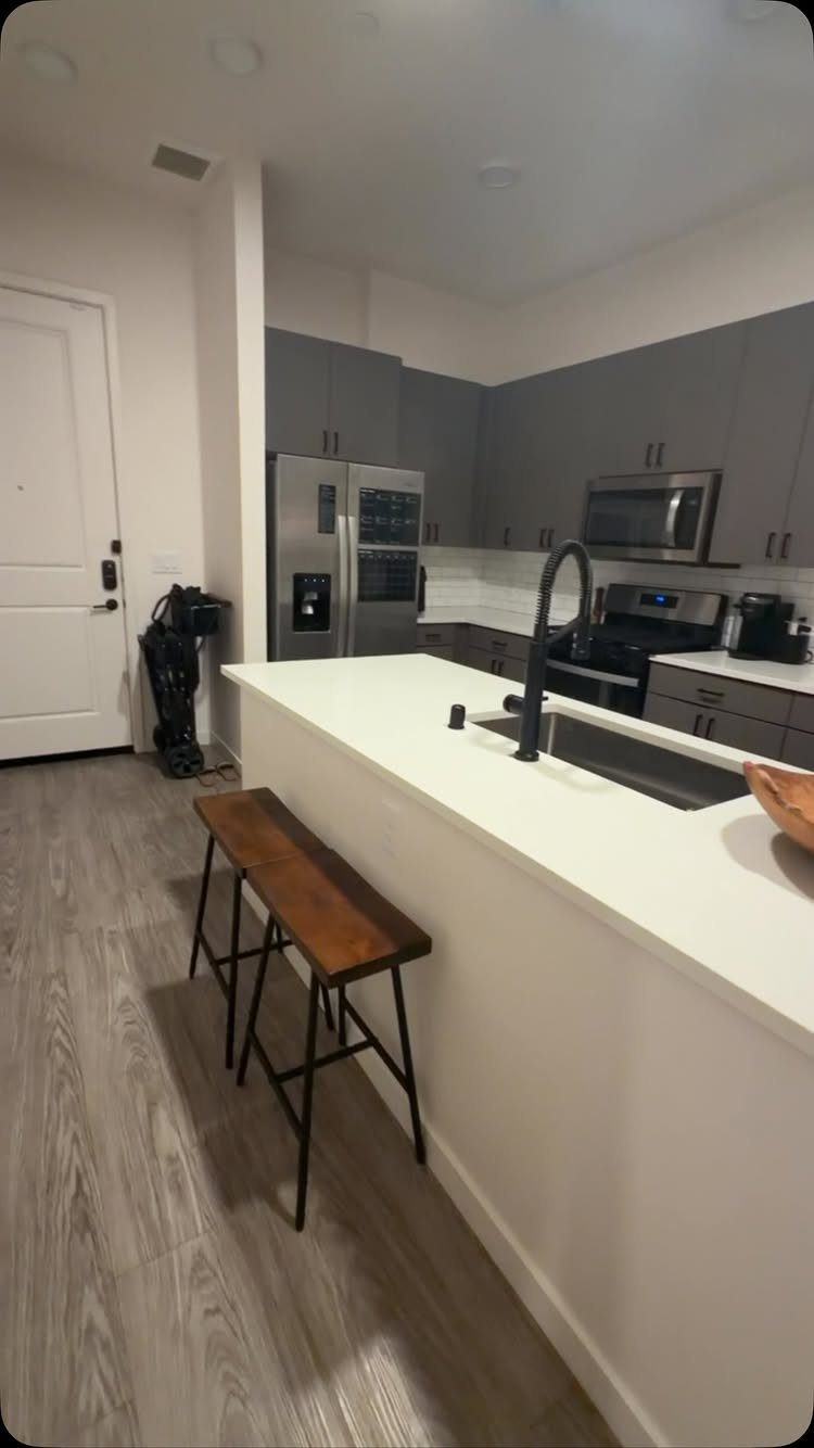
An island with a sink does the work of a counter and a table at once: you prep on it, rinse at it and eat at it.
Pairing white with grey cabinets keeps the island bright, and putting the sink in it saves a trip across the studio.
2 wooden stools are enough for a studio. I’d pick a wood tone close to the floor, as here, so the stools blend in and the island stays the focus.
Slide the stools fully under when you cook.
Benefits of Open Floor Plans
Light is the strongest argument for dropping the walls. With fewer partitions, sun from a single window reaches the whole main room, so mornings feel brighter and the space feels bigger than its square footage.
Hosting gets easier too. You stay in the conversation while you cook, instead of shut away in the kitchen.
An open plan also adapts. One table can serve as both dinner spot and desk, and sliding the coffee table aside leaves enough open floor for a home workout.
Without walls dictating where things go, you can try different furniture arrangements until one fits how you live. That freedom costs nothing, which suits a renter.
Challenges of Open Floor Plans
Sound is the biggest complaint. Conversation, kitchen appliances and the TV all share one acoustic space, so soft surfaces help: plush rugs, heavy curtains and upholstered furniture absorb noise that bare floors and hard walls bounce around.
Cooking smells spread to the sofa, curtains and bed. Run the range hood every time you cook, and keep it working well.
Privacy takes a little building. Tall bookshelves, a decorative screen or large plants can carve out a nook where you can be alone.
Conditioning a single large volume of air tends to push utility bills up, although a newer building with an efficient modern HVAC system usually narrows the gap.
Clutter has nowhere to hide here, so a stack of mail or a line of mugs on the counter shows from every corner of the room.
A closed cabinet or lidded bin within arm’s reach lets you sweep things out of sight in about 2 minutes.
Designing for Small Spaces
When floor space runs out, build up.
Pick furniture that does 2 jobs, so each piece earns its footprint.
Keep the colors in one cohesive family. A studio feels calmer and more pulled together when the eye stays within 2–3 related shades instead of bouncing between unrelated colors.
Before buying anything, decide what you will store and where. Storage that fits your actual belongings beats a clever piece that sits half empty.
“Having the same colors run throughout the pieces of furniture, artwork, and accessories will allow a studio apartment to feel bigger and more spacious.”Once you’ve determined that, she adds, it’s important to choose furnishings that do double or even triple duty.
Frequently Asked Questions
What is an open floor plan?
Take out most of the interior walls between the kitchen, living area and dining spot, and you get one big shared room, which is what an open floor plan means.
Only private rooms like bedrooms and bathrooms usually keep their walls. A semi-open plan keeps some structure, like a half wall, a column or a built-in shelf, so each zone gets its own edge without closing the room off.
What are the drawbacks of an open floor plan?
Sound is the main complaint, since talk, appliances and the TV share one space. Soft surfaces absorb sound, so rugs, thick curtains and upholstered pieces help a lot in a room with nothing to stop echo.
For privacy, a tall bookcase, a folding screen or a few large plants can mark off a corner, and closed cabinets or bins with lids hide clutter in about 2 minutes.
How do you divide an open concept studio apartment without building walls?
Turning the sofa so its back faces the bed is the easiest divider, with no building or drilling.
A geometric or wood slat screen also splits zones while letting light through, and a renter can take it along when moving out.
Pick dividers with wide gaps or big openings; a tight lattice blocks light and makes the room feel smaller.
What are common mistakes in studio apartment decor?
Bulky furniture, dark colors and clutter are the usual culprits. Stick to 2–3 related shades so the whole room reads as one calm space and the eye has nowhere jumpy to land.