Owning or renting decides which of these colors is yours: if you can paint, a black vanity or one dark green wall is a weekend job, and if you can’t, towels, a rug and gold fixtures carry a color without touching a surface.
Whatever you pick, buy mildew-resistant paint in semi-gloss or satin, or a bath-rated matte like Benjamin Moore’s Aura Bath & Spa, and test the sample in morning, midday and evening light.
1. Earthy Gray
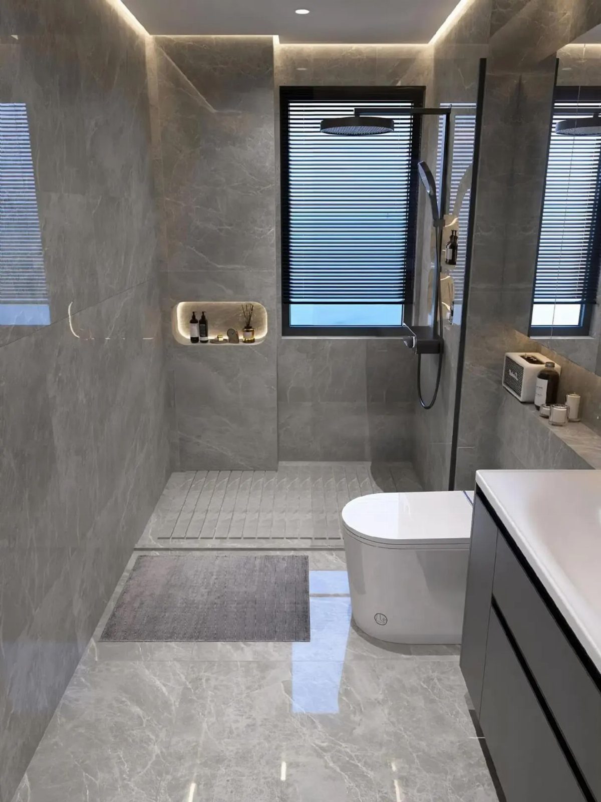
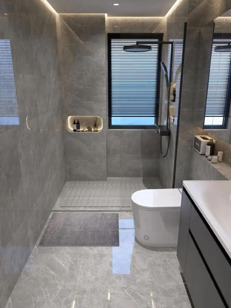
Gray reads calmest when it has some warmth in it, and large marble slabs on both walls and floor do that without any extra decor.
A dark gray vanity grounds all that pale stone, so the room doesn’t feel washed out.
On a budget, I’d copy the formula rather than the material: a marble-look tile in one gray family, then a darker vanity in paint. Keep the fixtures and toilet white so the gray stays the only star.
2. Black
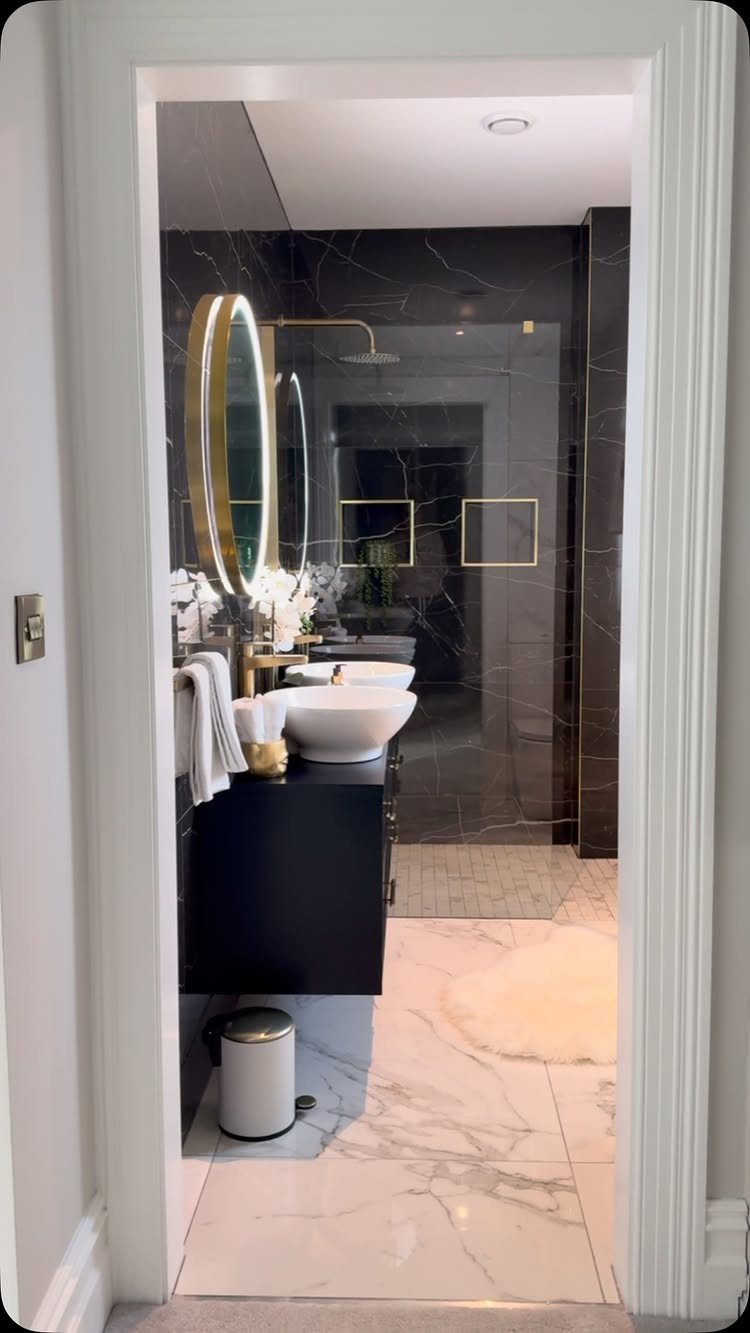
Black walls and a black vanity only work when something bright interrupts them, and a white vessel sink does that job well. White marble floors keep the room from turning into a cave.
Gold on the mirror frame and faucet adds warmth to all that black. I’d limit gold to two or three pieces so it stays an accent.
Paint is the cheap way in: a black vanity and one dark wall will give you the drama for a weekend and a small outlay.
3. Dark Green
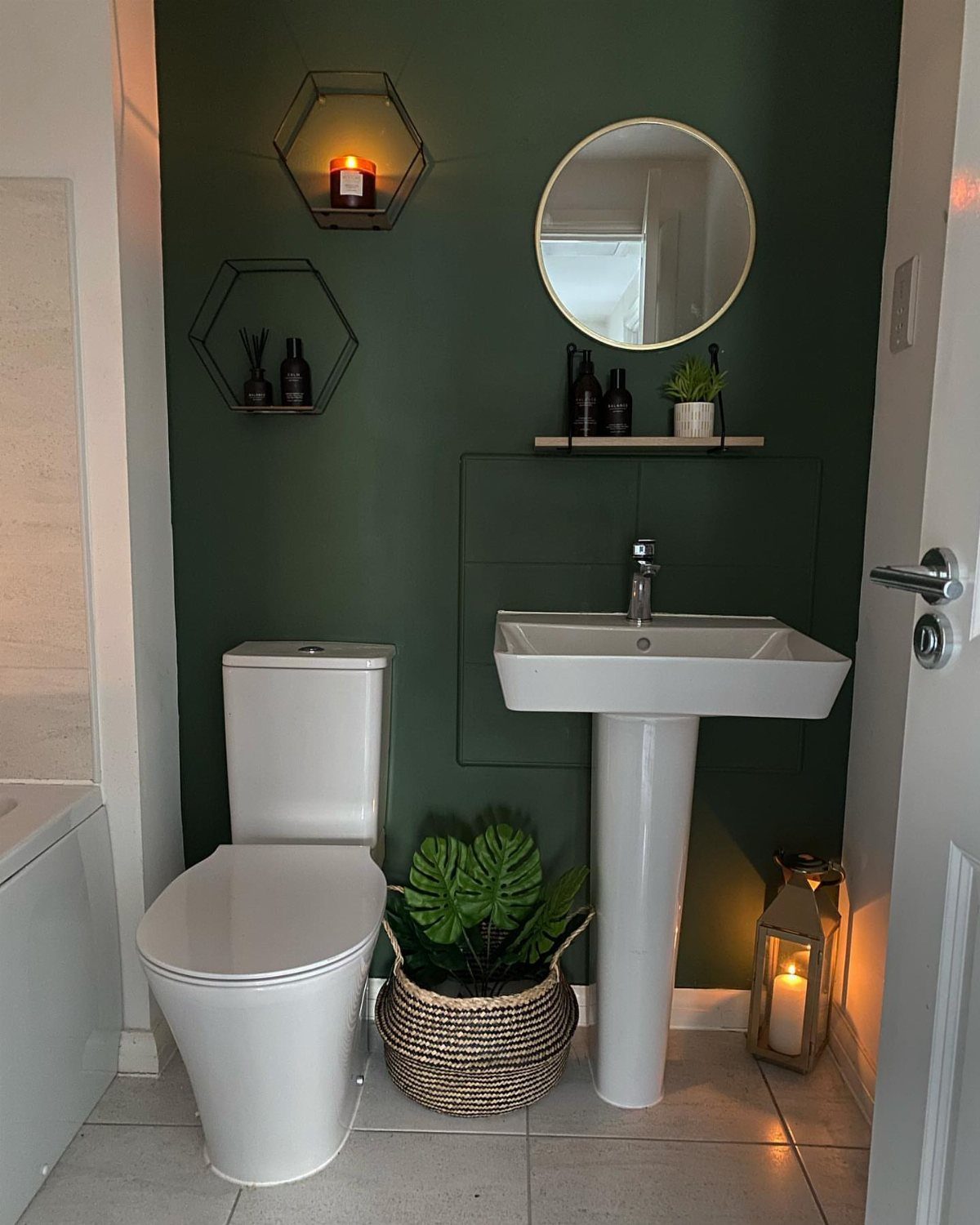
A small bathroom painted dark green on every wall feels like a little garden room, and that’s the reason I’d choose it over another white box. White fixtures, a pedestal sink and a round mirror stay crisp against the color.
Add a potted plant and a few shelves, and the green gets echoed instead of left alone.
One caution: a window-less or dim room will look deeper still, so test a sample on the wall before you buy a gallon.
4. Soft Yellow

Soft yellow tile laid in vertical stripes with cream does something paint can’t: it draws the eye up and makes the ceiling feel higher. Gold fixtures sit comfortably in that warm palette.
I’d keep the stripes to 2 close shades. A wide gap between them gets busy fast, and in a small room that busyness is the overwhelming part.
If tile is out of reach, paint one stripe-patterned wall only and leave the rest cream.
5. Gold Fixtures
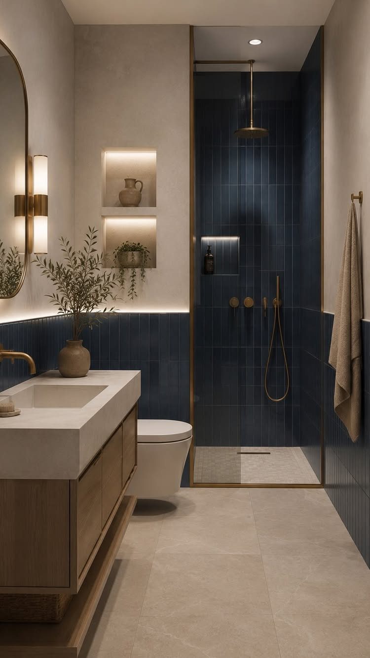
Gold against navy tile is a pairing I’d pick over chrome every time.
Gold faucets, showerheads and towel bars pick up warmth against dark blue tile or concrete, and the combination reads far more intentional than chrome ever would in the same room.
Matching all 3 finishes matters more than the shade of gold. Mixed tones look like a mistake.
Swapping a faucet and a towel bar is a one-afternoon job, so this is among the easier ways to change a bathroom’s feel on a small budget.
6. Pink
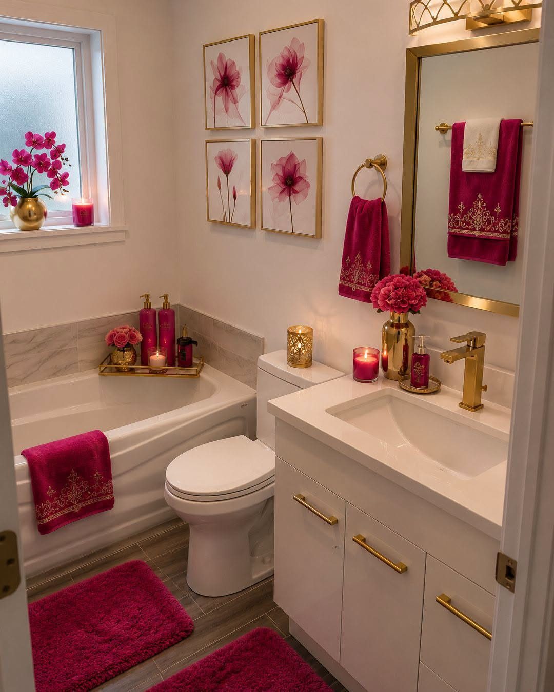
Pink can live entirely in the textiles. A white bathroom stays a neutral shell while bright pink towels, bath mats, flowers and artwork carry the color, and gold fixtures keep it warm instead of sugary.
That makes it the renter’s version: nothing gets painted, and swapping the towels changes the whole mood.
I’d stay with one pink shade across every piece. Several pinks together start to look accidental.
7. White
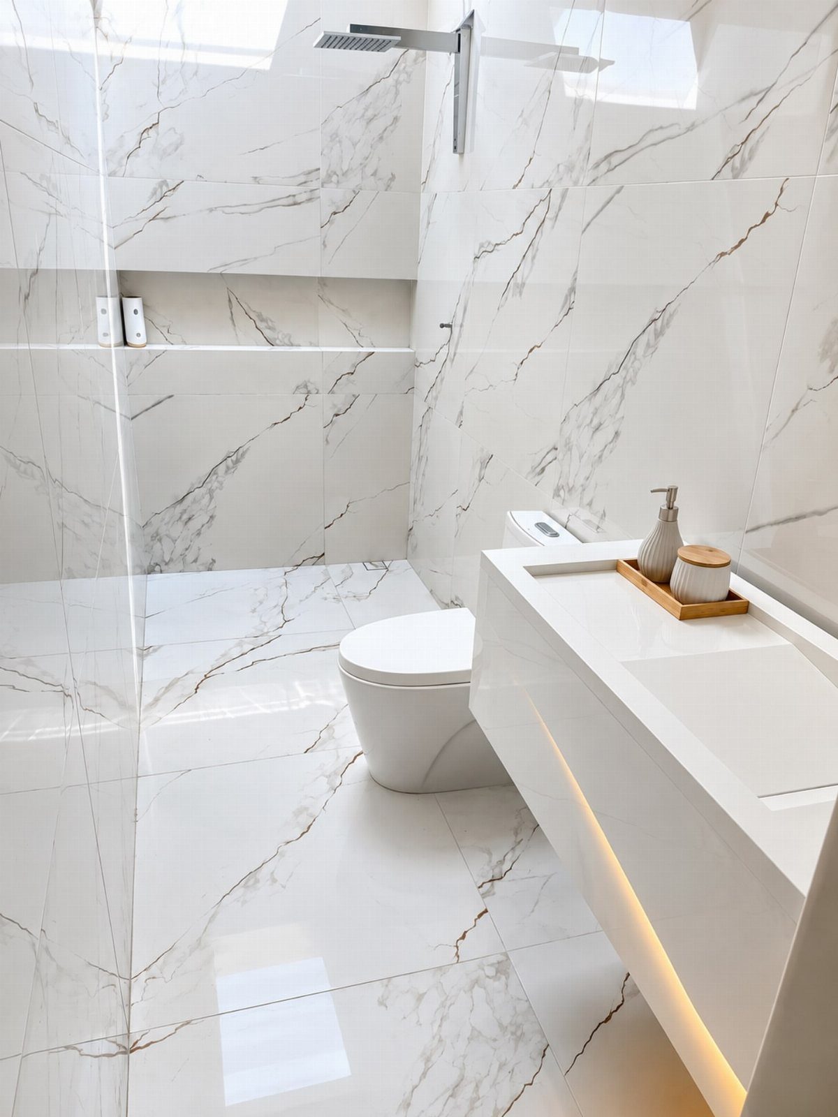
White marble-look tile with a floating white vanity gives a bathroom a clean, bright base, and the under-cabinet lighting adds a soft glow along the floor. Chrome shower fixtures suit it well and keep the palette cool.
White is the easy choice when you may change your mind later. Towels, a bath mat or a plant can change the mood without touching the tile.
I’d pick a tile with soft gray veining over pure white, since plain white shows every smudge.
8. Navy Blue
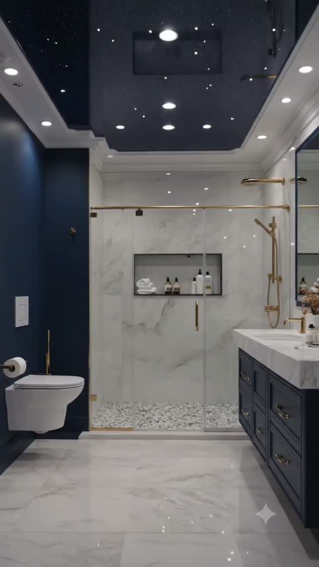
Navy walls beside white marble give a bathroom depth that a lighter blue can’t match. The navy vanity echoes the walls, and gold fixtures warm up all that blue.
A starry ceiling is a bold extra I’d treat as optional. Navy paint on the walls and vanity gets you most of the effect for a weekend and a small spend.
Keep the floor and shower walls white so the room stays bright. Navy everywhere would close it in.
9. Bright Red
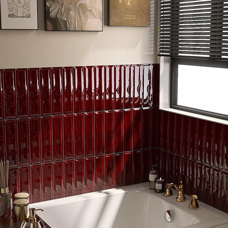
Glossy red tile in vertical rows packs a lot of punch into a small bathroom, because the shine bounces light around. I’d use it on one wall only, behind the tub, and leave everything else quiet.
A white tub, gold fixtures and simple black blinds let the red do the talking. Framed art adds a little personality without competing.
Tile is a bigger job than paint. If that’s out of reach, one red-painted wall in a gloss finish borrows some of the same drama.
10. Sage Green
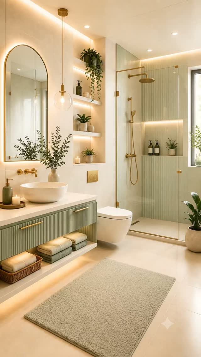
Sage green on both cabinets and wall tile makes a bathroom feel calm, like a small spa. Ribbed cabinet fronts add texture so the single color doesn’t look flat.
Gold fixtures and warm lighting keep the green from turning cold. A white vessel sink brightens the whole setup.
For a cheaper route, I’d paint the vanity sage and keep the walls pale. You get the soft color without tiling anything.
11. Mustard Yellow
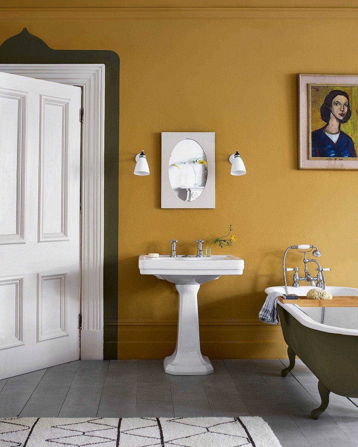
Mustard walls turn a plain bathroom into a warm, slightly vintage room, and a white pedestal sink keeps it from feeling heavy.
A green clawfoot tub is a bold partner, though I’d say it works because the mustard is the star.
A small oval mirror and one portrait painting are enough decor here. More would crowd the color.
Paint is the low-cost way in. Test a sample first, since mustard can swing greener or browner depending on your light.
12. Seafoam/Light Blue
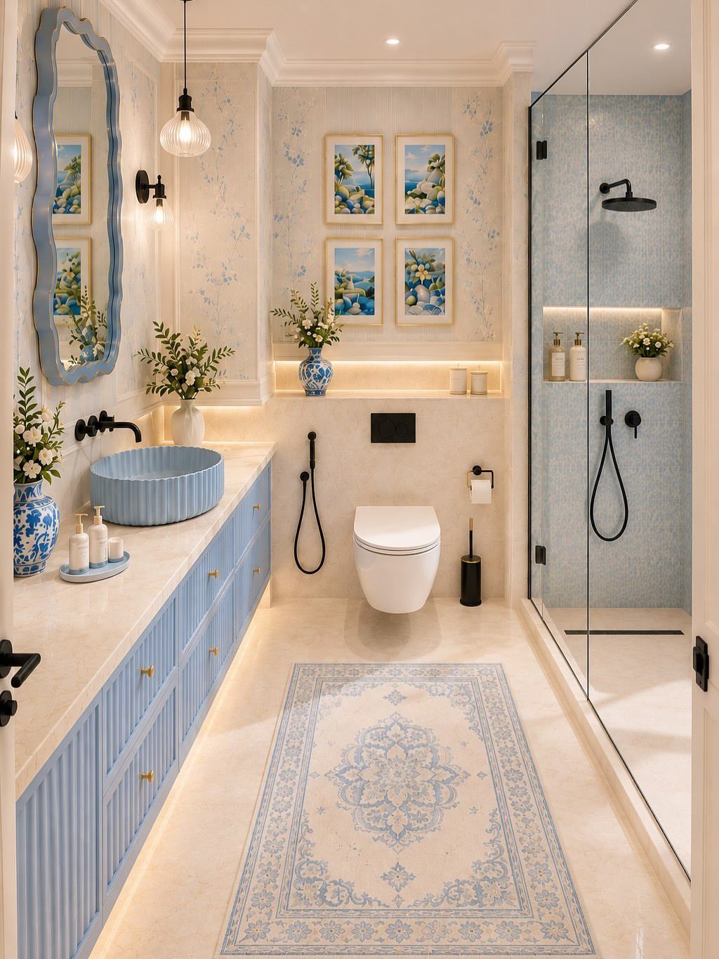
Light blue on the vanity and sink, picked up again in a patterned rug, gives a bathroom an airy, fresh feel. The color repeats in the artwork, which ties the room together.
The rug is the renter’s shortcut: it’s cheap and removable, and it carries the blue even if the cabinets stay put.
I’d keep the blue shades close to each other. Matching pieces look calm, while mismatched blues look unplanned.
13. Teal
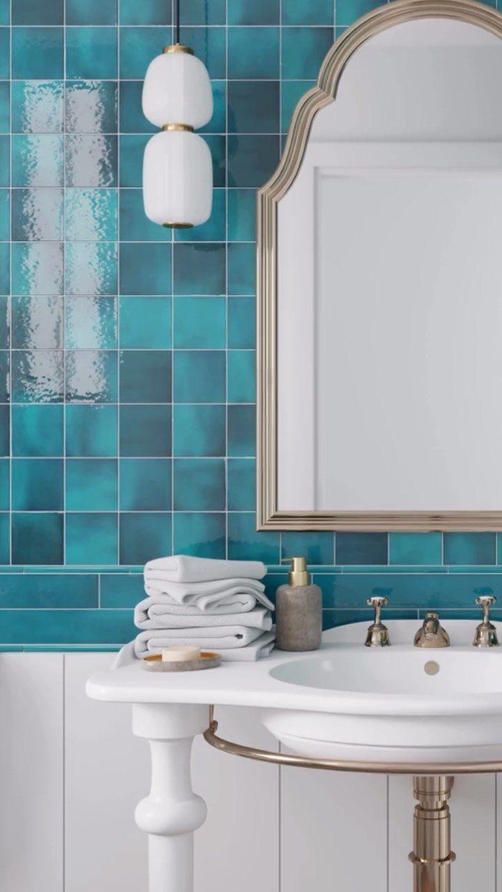
Teal splits the difference between blue and green, so it suits anyone who can’t pick one.
Putting teal on just one wall, such as the one behind the vanity, puts the color where your eye lands without closing in a small room.
For a weekend version, paint one teal wall and add a gold-framed mirror.
14. Monochrome Schemes
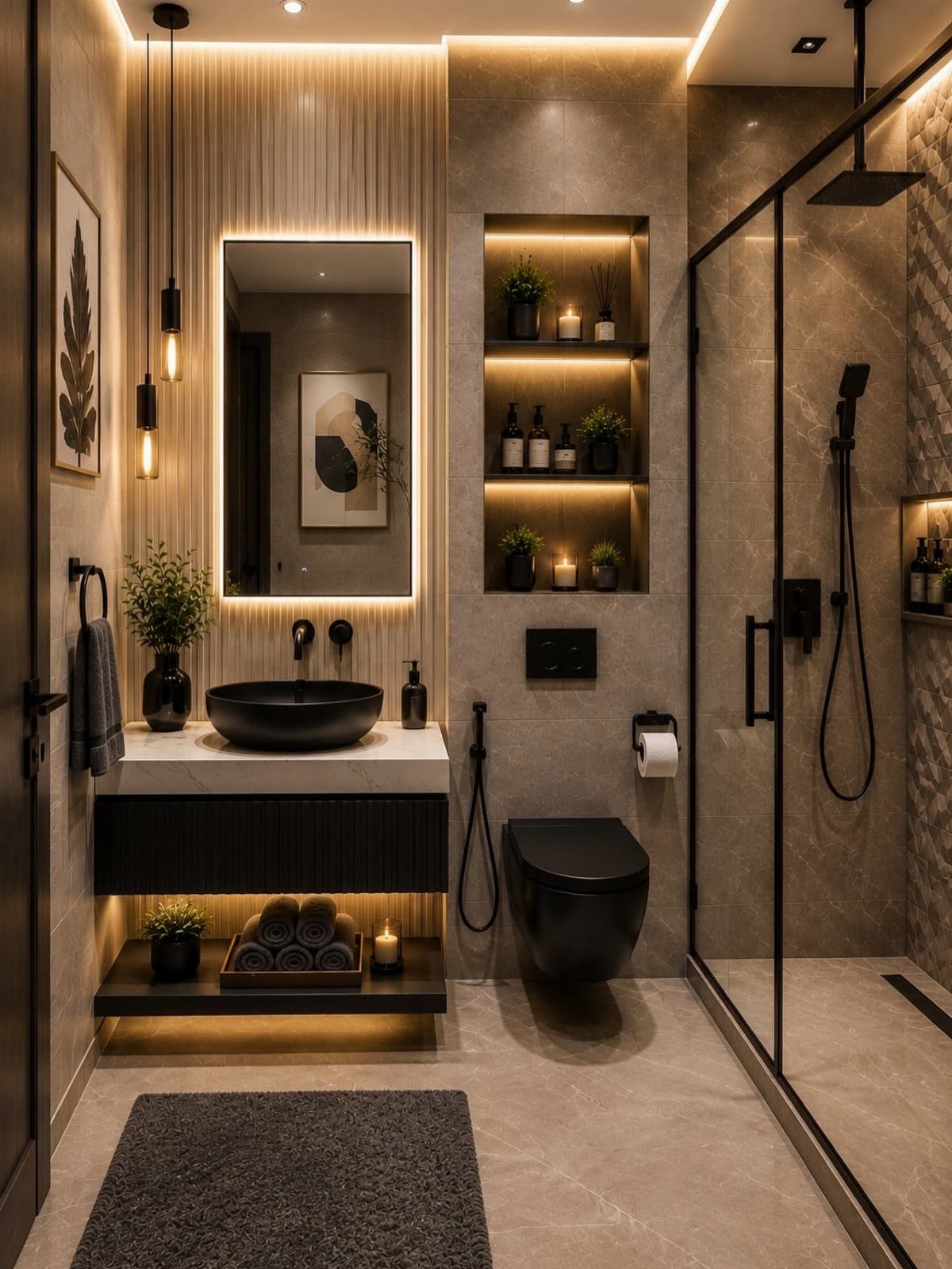
Warm lighting matters here. A backlit mirror and recessed shelves with plants keep the browns glowing instead of muddy.
I’d choose two or three shades, no more, and let the black do the contrast.
15. Warm Beige
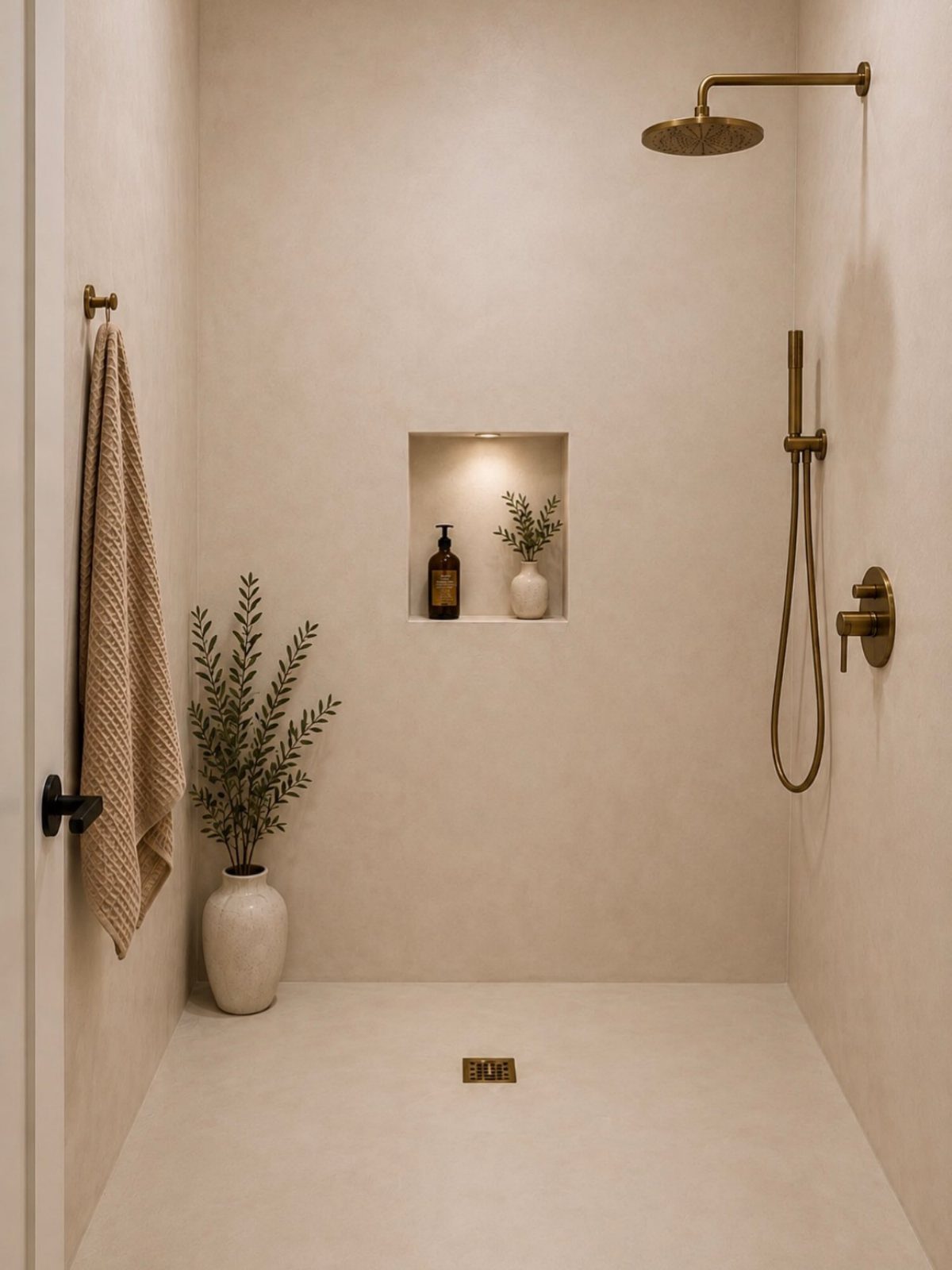
Carry warm beige across both the walls and the floor of a walk-in shower, and the space reads as one unbroken surface.
Gold fixtures stand out against it without any help, and a recessed niche keeps bottles off the floor so the lines stay clean.
This is the pricier, more polished route, and I’d say it pays off in a calm room.
Keep the tile and grout in the same tone for an unbroken look.
16. Dusty Rose
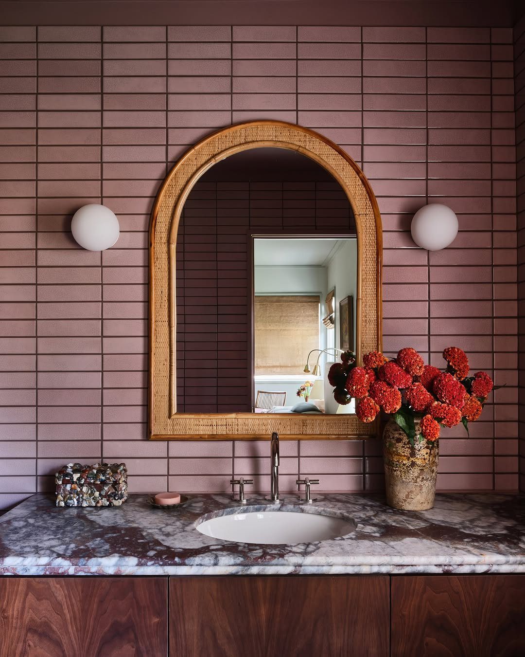
Dusty rose tile gives a bathroom a softer, grown-up take on pink. Marble on the counter and an arched mirror suit this shade, and a rattan frame adds texture so the wall doesn’t look flat.
I’d keep the rest quiet so the muted rose stays the point of the room.
If tiling the wall is too much, paint a dusty rose wall behind the vanity and hang an arched mirror in front of it.
17. Burgundy
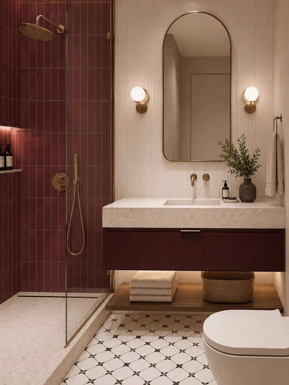
Burgundy tile in the shower, matched by a burgundy vanity, turns a bathroom into something playful and a little unexpected. Gold fixtures and an arched mirror keep a deep red from turning heavy and make it feel rich.
I’d pick one burgundy and repeat it exactly. Painting the vanity is the budget move, and it takes a weekend.
18. Lilac
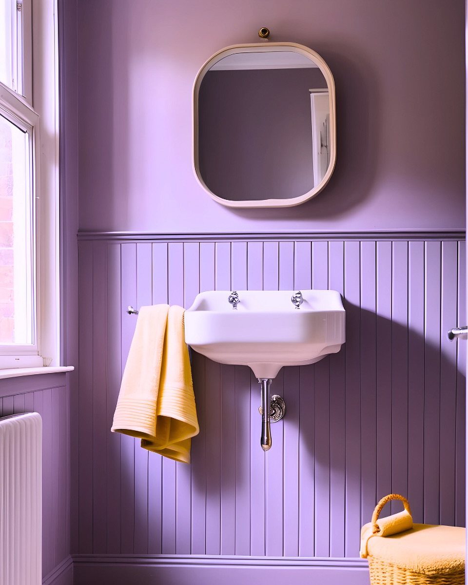
Lilac wall paint with matching wainscoting looks elegant and quiet, and a white sink keeps it fresh. Painting the paneling the same shade as the wall is what makes it feel soft instead of busy.
Yellow accents, like the towel and basket here, give lilac a lively partner. Metallic finishes such as gold also suit it well.
19. Wood Cabinetry
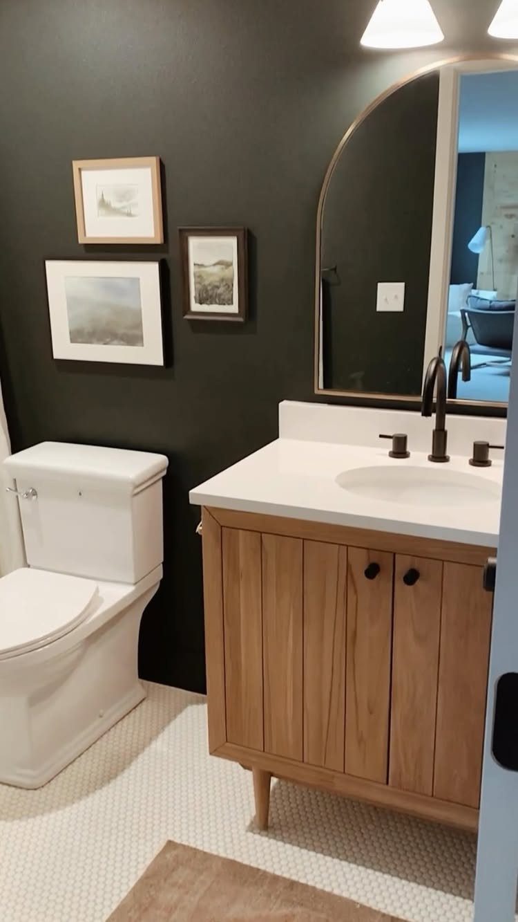
A light wood vanity is the warm spot in a room of dark gray walls, and it keeps the gray from feeling flat or cold.
The white countertop and sink sit on top of the wood and stay crisp against both.
I’d keep the wood to the vanity alone, since a single warm piece reads more deliberate than wood on several surfaces.
If replacing the cabinet isn’t in the budget, a dark wall behind a light wood vanity is the part worth copying.
Choosing the Right Color Scheme
Room size sets the starting rule: light colors make a small bathroom feel larger, and deeper shades make a big one feel more intimate.
A color you love can still work against the rule if the lighting is good and you add white accents to keep it from closing in.
Decide the feeling first. Pale, open shades suit a bathroom meant to feel light and spacious, while a room you want to feel like a hideaway can carry deeper, moodier tones.
Color also affects upkeep. The right paint can bring out natural light, add texture and make cleaning easier, so think about how the room gets used each day before you commit to a shade.
Marie Cloud, owner and principal designer of Charlotte-based Indigo Pruitt Design Studio, says that popular bathroom color schemes are striking a ‘perfect’ balance between ‘calm and punch’ as of late.
Impact of Natural Light
Natural light changes how a paint color reads through the day, so judge a sample in the morning, at midday and in the evening before you buy.
With plenty of daylight, white and soft pastel walls look clean and flattering instead of flat.
Dark paint gets more intense in a small bathroom, and that can feel snug and enclosed in a good way if you balance it with warm touches like brass, wood, or amber bulbs.
Mirrors help most in a dim room, since they bounce daylight around and make the space feel bigger. Sheer shower curtains or blinds let light in while keeping privacy.
Place light fixtures near the window or use wall-mounted lights, so the light spreads evenly and the wall color looks the same across the room.
Finishes for Bathroom Paint
Paint finish matters in a room that fills with steam. Shiny finishes were once the only safe choice against humidity, and semi-gloss and satin are still the standard picks for moisture resistance.
Matte has become an option, though only in paints made for bathrooms. Benjamin Moore’s Aura Bath & Spa is a mildew-resistant matte that softens a room full of tile, mirrors and metal fixtures.
Whatever finish you choose, buy paint formulated for bathrooms.
Brands like Behr and Benjamin Moore make mildew-resistant lines that hold up in humidity, keep their color longer and cover better, which is worth a few extra dollars per gallon on a project you’ll live with.
Frequently Asked Questions
What is a nice color to paint your bathroom?
Soft gray, sage green, and white are the safest picks, and each one holds up for years.
Sage on a vanity with pale walls feels like a small spa, and a gray with some warmth in it stays calm without going flat.
If you want more color, dark green or navy on the walls works well against white fixtures.
What color is replacing gray in 2026?
Earthy tones and warmer neutrals are taking over from cool gray.
Warm beige, sage green, and dusty rose are good examples, and gold fixtures keep them from feeling cold. If you still like gray, choose one with warmth in it and pair it with a light wood vanity.
Should bathroom color be lighter or darker?
Go lighter in a small bathroom and darker in a large one.
Pale walls push the edges of a small bathroom outward, and a dark color pulls a large one in around you, so match the shade to what the room needs: more air or more coziness.
Good lighting and white accents let you break that rule with a color you love.